
Dedicated Mobile Site vs Responsive Design - Top 4 Must-Have Features
Dedicated Responsive Design vs Mobile Site LaunchCMS by Tommy House Studios
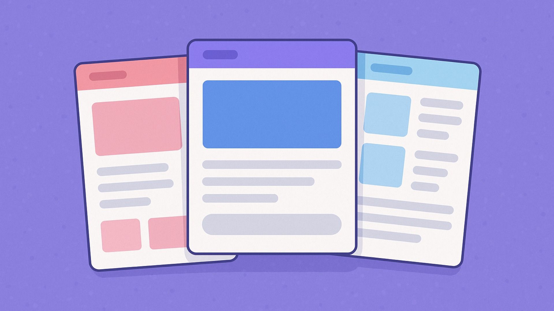
Dedicated mobile site vs responsive design... Having a mobile friend website is very important these days. You can do this with either a dedicated mobile site or one that is responsive. So, dedicated mobile site vs responsive design? Your desktop dedicated website for your small business must be mobile friendly and responsive to various displays. Mobile friendly vs. responsive? Read on...

The Top 4 Must-Have Features of A Mobile-Friendly Website
Creating a Dedicated Mobile Website: 4 Must-Have Features
As more and more people are using mobile devices to access the internet, it's essential that businesses create a dedicated mobile website with the key features that users need. While there are many different approaches to creating a mobile website, such as a responsive design or a separate dedicated mobile site, the latter option has become increasingly popular for its ability to provide a tailored experience for mobile users.
So the question may come up... "a dedicated mobile website" vs a "responsive design website"? Both dedicated mobile or responsive design websites each have their benefits. We tend to lean towards a responsive design website for ease of management and lower expenses for the business owner.
Here are 4 must-have features for any dedicated mobile website:
- Speed and Performance: Speed is a crucial factor for mobile websites, as users expect a smooth, fast experience even on devices with slower connection speeds. Your mobile website should be optimized for speed, with optimized images and videos, and a streamlined design that makes it easy to load and navigate.
- Responsive Design: Responsive design ensures that your website looks great on any device and screen size, and is essential for any dedicated mobile website. By using responsive design, you can create a website that looks great and functions properly regardless of the device it's being viewed on.
- Mobile-Friendly Navigation: Mobile users need a navigation system that is easy to use, so make sure your mobile website has a navigation system that is designed specifically for mobile devices. This should include clear labels and links, as well as a search bar for users to quickly find what they need.
- Focus on Content: Content is still king when it comes to mobile websites, so make sure that your content is easy to read and navigate on smaller screens. Prioritize essential content such as text, images, and videos, and make sure that they are all optimized for mobile devices.
By following these tips, you can create a dedicated mobile website with the features that mobile users need. With a dedicated mobile website, you can provide a tailored experience that is sure to impress your visitors.
When it comes to marketing and online visibility, businesses are always looking for new ways to stand out. So what does that mean for websites? Because the internet is more accessible than ever before, Google searches, social media, and other search engines have become an important part of advertising for businesses. In fact, 94% of customers will leave a website if it isn’t mobile-friendly. The same goes for other sites like Yelp and TripAdvisor — users expect them to be mobile-friendly so they can research businesses on their smartphones. If your site isn’t mobile friendly, you could be losing potential customers or even current customers who check your site on their phones regularly. Here are four must-have features of a mobile-friendly website that will help keep your business ahead of the curve:
Faster page load times
If your site doesn’t load quickly, you’ll lose potential customers. In fact, 40% of people will abandon a site if it takes longer than 3 seconds to load. These customers won’t be able to find the information they were looking for. Even worse, customers who experience poor page load times will tell their friends and family members about their experience. So those people could also be turned off by your site if it takes too long to load. Your best bet is to host your site on a server that’s close to your customers. This will help ensure that your site loads quickly for people across the country.
Responsive design
When you create a mobile-friendly website, you’re essentially designing one website that will work on all devices, from smartphones to desktop computers. Visitors to your site on their smartphones will see the same content and have the same experience as visitors on their desktop computers. When you have a responsive website, the layout will change depending on the device you’re using to view it. If you’re on a computer, you’ll see one layout. If you’re on a tablet, you’ll see a different layout. And if you’re on a smartphone, you’ll see yet another layout. To create a responsive website, you’ll need to hire a web developer. Because responsive design is a complicated process, it’s best to work with a team of professionals who know how to do this.
Easy-to-find contact information
A big part of online customer service is having an easy-to-find contact page. This is where customers can go to ask questions about your products or services. If a customer is looking for your phone number but can’t locate it on your website, they might leave your website without buying anything. This happens a lot: 75% of customers expect businesses to have a contact option on the website. 82% of customers expect to be able to contact the company via email, and 64% expect to be able to use a live chat option.
User-friendly navigation
People expect websites to be navigated in certain ways: They want to be able to click on a product or service and find out more about it. are a few important questions you’ll want to answer on your website: If you’re hosting an event, you’ll want to tell people when and where it is. If you need help, you’ll want to tell people how they can get in touch with you. When you have a mobile-friendly website, you can include all of this important information in a simple and easy-to-read format.
Summing up
If you want your business to succeed in the modern world, you’ll need to have a mobile-friendly website. This is the only way to stay ahead of the competition and keep customers coming through your doors. If you want to stay ahead of the competition, you need a mobile-friendly website. This is the only way to keep customers coming through your doors. There are four must-have features of a mobile-friendly website that will help you stay competitive and attract more visitors to your site. Guess what? LaunchCMS allows you to do all of this and more! Contact us today and let us help yo get started with your new website!
LaunchCMS.com - Blog


