
Site Responsive Design | LaunchCMS by Tommy House Studios
Site Responsive Design
What's the deal with having a responsive website deign?
Site Responsive Design, Responsive website design or Responsive Site Design has become increasingly important for businesses looking to optimize their presence online. With more and more users accessing websites on mobile devices, it’s essential to have a digital presence that is optimized for any screen size. Responsive websites are able to adapt their layout based on the screen size of the device viewing the site, instead of having separate mobile and desktop versions.
With responsive website design, you can create a single webpage that responds to the user’s screen size, which optimizes your site for any device. This article will introduce you to responsive web design, its advantages and its main principles. Furthermore, we’ll explore why you should consider switching from static sites to dynamic ones, what kinds of content are suitable for dynamic websites and examples of great responsive websites.
What is Site Responsive Design or Responsive Web Design?
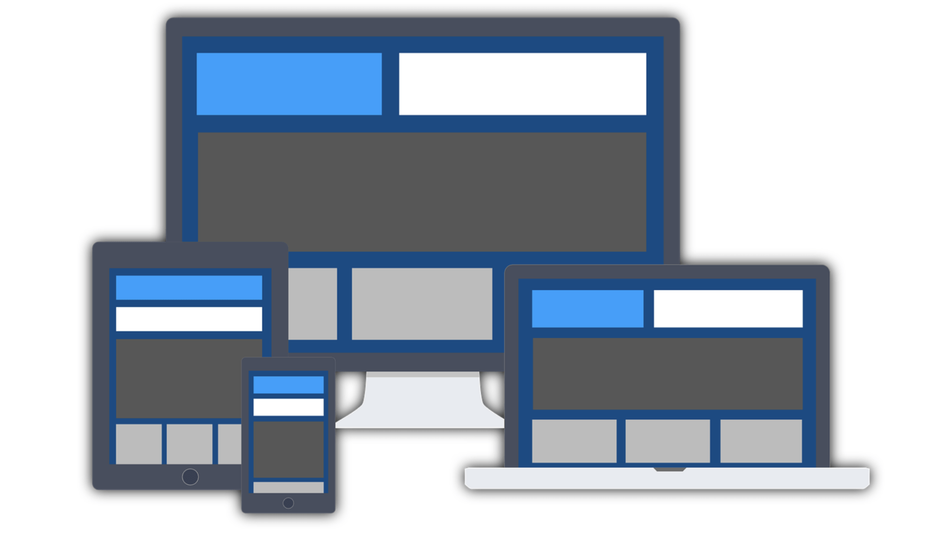
Responsive web design is a technique used for creating websites that respond to the user’s screen size by adapting their content and functionality accordingly. This functionality is achieved through CSS, which is responsible for the visual design of a webpage as well as additional functionality. One of the most important elements of responsive web design is fluid layouts, which allow elements on a webpage, such as images and text, to be resized automatically based on the screen size of your visitors.
As screen sizes vary greatly, a fixed layout would not work, as elements would either be too big or too small, hindering the user experience. A website that’s responsive adapts to the device it’s being viewed on, whether that’s desktop, laptop, tablet or smartphone. Therefore, it’s accessible to a greater number of people, who can view your website on any device and from anywhere.
Why is Responsive Site Design Important?
If you’re not yet familiar with the importance of responsive web design, you may soon become so. With the rise of mobile devices like smartphones, tablets and, to some extent, phablets, the importance of responsive website design is growing by the day. With a responsive website, you’re able to optimize your Web presence to be accessible to a much wider audience. Some businesses may still be operating under the assumption that only desktop computers are used to visit their website, which is, unfortunately, no longer the case. A high percentage of people now access the internet from their mobile devices, so non-responsive websites are now a big turn-off for many visitors.
If you’re still not convinced of the importance of responsive website design, consider this: according to a survey conducted by Forbes, over 25% of mobile users would rather leave a company’s site than struggle with a poorly designed site on their phone. Moreover, regular website visitors are more likely to return to a responsive site than a non-responsive one.
Advantages of Responsive Site Design
There are a number of advantages to creating a responsive website. A few of these include:
- Increased Traffic: A single website that is optimized for all screen sizes (especially mobile) will be a lot easier to navigate than three different sites. This means that you’ll have a larger audience to tap into, which will translate into more traffic.
- Improved User Experience: If your site is not designed to be viewed on every screen size, then it’s like having two different sites. The visitor who is using a large screen may get frustrated when he or she is suddenly surprised by zooming images or hidden content. On the other hand, a smaller screen visitor may be left out in the cold if the images are too large to fit on his or her screen.
- Better Brand Recognition: A responsive site is a more consistent representation of your brand, which will likely lead to more recognition.
- Improved SEO: It’s no secret that search engine optimization is an important aspect of any website, but it becomes especially important when it comes to mobile sites.
The Basics of Responsive Web Design
- Screen Size: The first step in creating a responsive website is to determine the screen size that you’re designing for. It’s important to keep in mind that smartphones come in many different screen sizes, so it’s best to target the most popular ones.
- Content: Your website needs to adjust not only its visuals but also its content to work on different screen sizes. This means that you need to have a strategy for dealing with different screen widths.
- Navigation: Responsive navigation is important when it comes to mobile devices, as they usually have smaller screens than desktop computers. This is why it’s best to use drop-down navigation menus on your mobile website.
Responsive Web Design Checklist
- Consider the different types of devices that your website is likely to be viewed on - desktops, laptops, tablets and smartphones.
- Develop a strategy for dealing with different screen widths. - Make sure your website has a consistent design.
- Use responsive images. - Define how your website will respond to different screen sizes.
- Add alternative content for smaller screens. - Make sure your website is accessible on mobile devices.
- Test your website for responsiveness using browser tools.
Final Words
As you can see, creating a responsive website is no easy task. You’ll have to consider a lot of different things, and you may have to make some sacrifices. However, the benefits of having a responsive website are well worth it. You’ll be able to increase your website traffic, which means that you’ll have a wider audience to tap into and make more sales. You’ll also have a better user experience, as each device will be able to see your site in a way that is tailored to their screen size.
Finally, you’ll have a consistent brand representation across all devices, which will likely lead to better brand recognition. Creating a responsive website is a big task, but it’s well worth it. When it comes to successful digital marketing campaigns, a responsive web design is one of the most important factors in determining your ROI and LaunchCMS by Tommy House Studios can take you there!
LaunchCMS.com - Blog


